How many recycling symbols are you able to identify?
Editorial | UI design | Strategy | Research
The Challenge
In particular, environmental awareness has increased over the past decade, there are numerous ways to encourage people to take action, and recycling behaviour is gradually improving. But there are times when it does not seem sufficient for society to be well educated on the knowledge of recycling symbols. And this concerns me.
It’s a sort of symbol that people see on a daily basis. But a lot of people are still unaware of what is and what rules should be followed. As a graphic designer, knowledge of the recycling symbols will help as you design the visual exterior of the package or any relevant product. Moreover, you can represent them on the layout considerably and well designed. In the process, it is the benefit of having a chance to learn the structure and ideas that underlie these original symbols.
However, the ultimate goal is that I hope to help and improve human behaviour in recycling, and encourage the related departments to improve the symbol design which easily misleads or overly complex.
The Solution
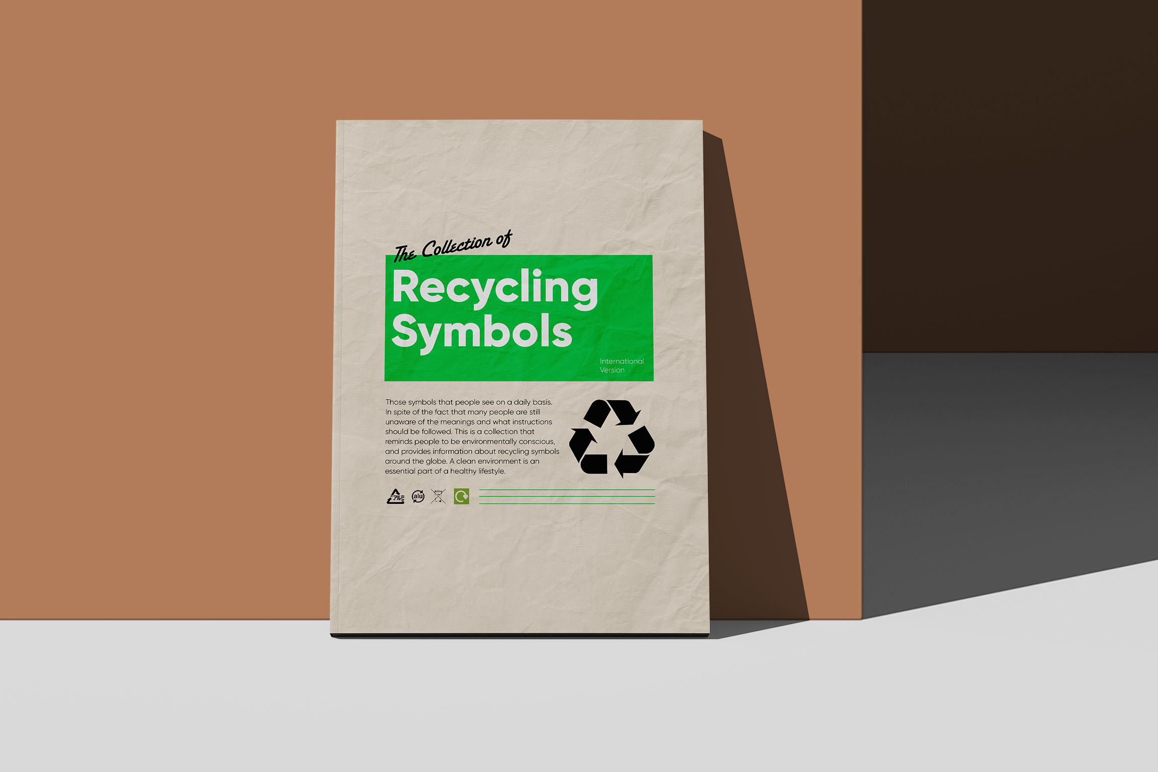
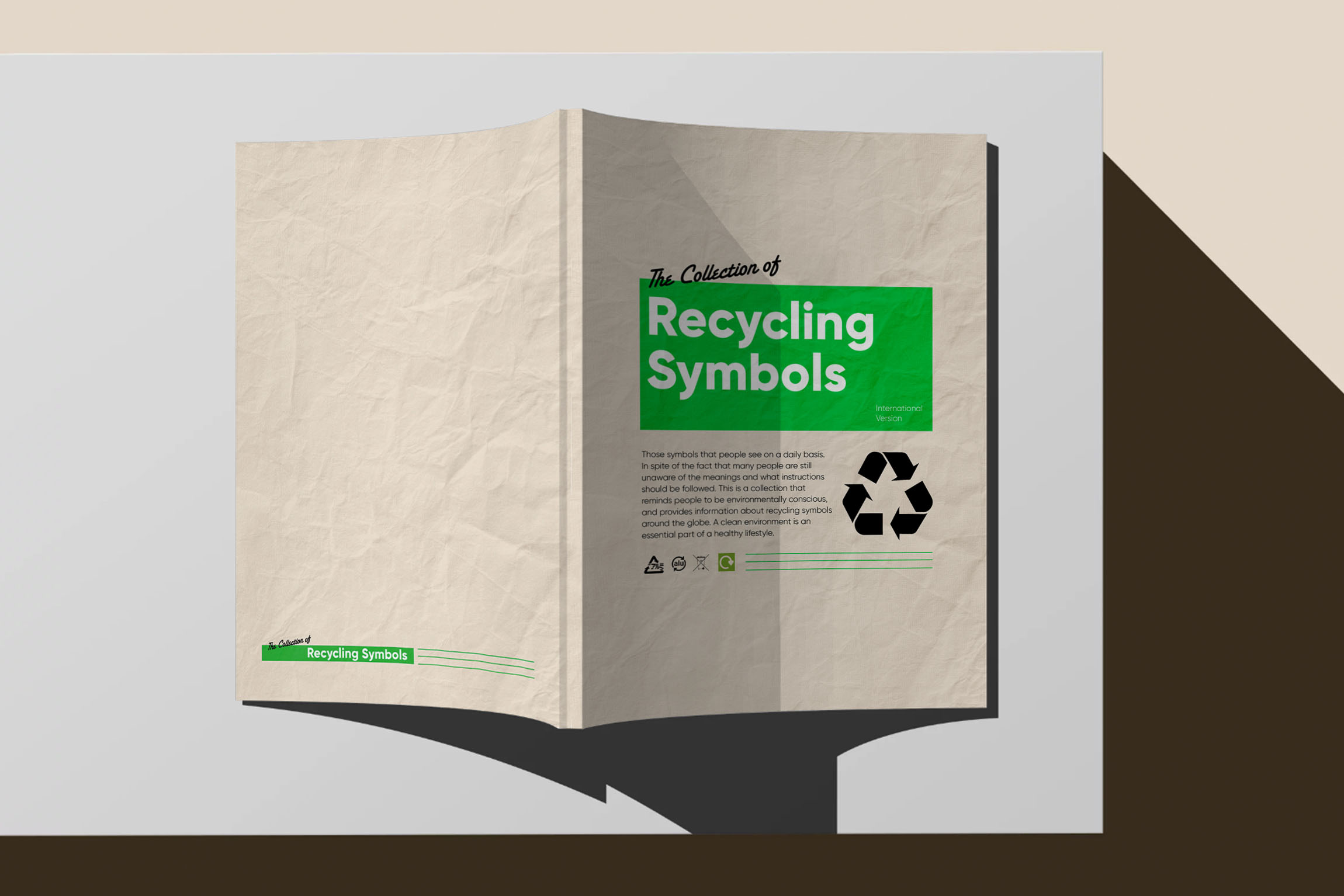
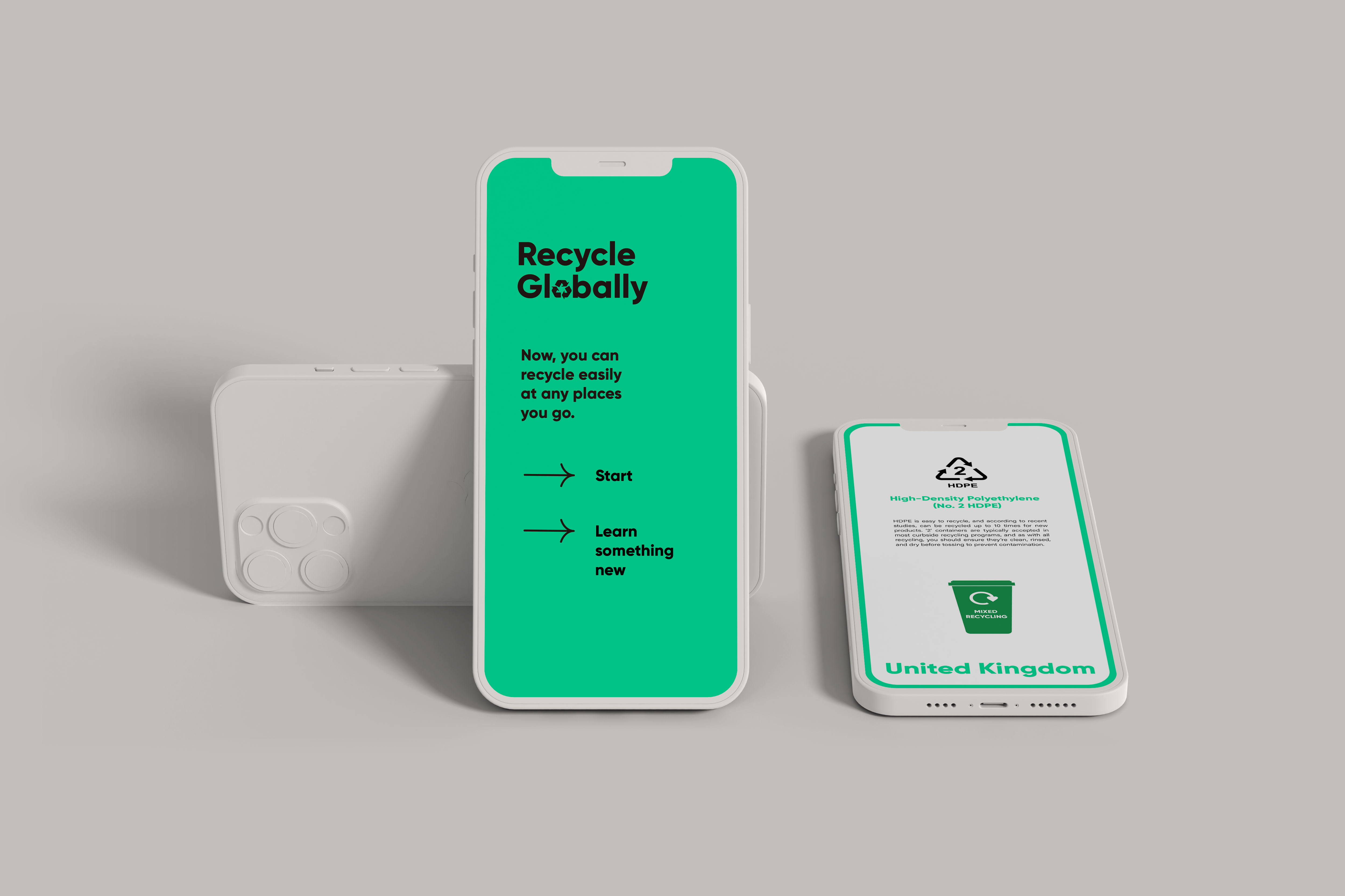
An archive is not just for recording the information, it allows people to use it for evidence and research. Based on the function of the catalogue, I have a tendency to make a clear and logical arrangement. The data is readily available and explained. Therefore, when the user reads it, they are capable of understanding. This involves collecting recycling symbols that are used in different countries and various material products. In general, people will not be interested in reading archives with a lot of data, this is a kind of tool function. For the solution, the design of the cover I used the bright green colour with a big recycling symbol to get people’s at- tention. And the background image I used recycled paper materials that reflects the meaning of recycling.
The idea of an App development is to enable people to easily access information about recycling and even when people travel to different countries with language difficulties. A meaningful recycling program can also help improve the environment and lay the groundwork for communities that grow sustainably. This user interface design is meant to be easy for an audience while having access to use it and feel that it is interesting.