Sometimes they look like just normal people

Editorial | Motion Design | Strategy | Research
The Challenge
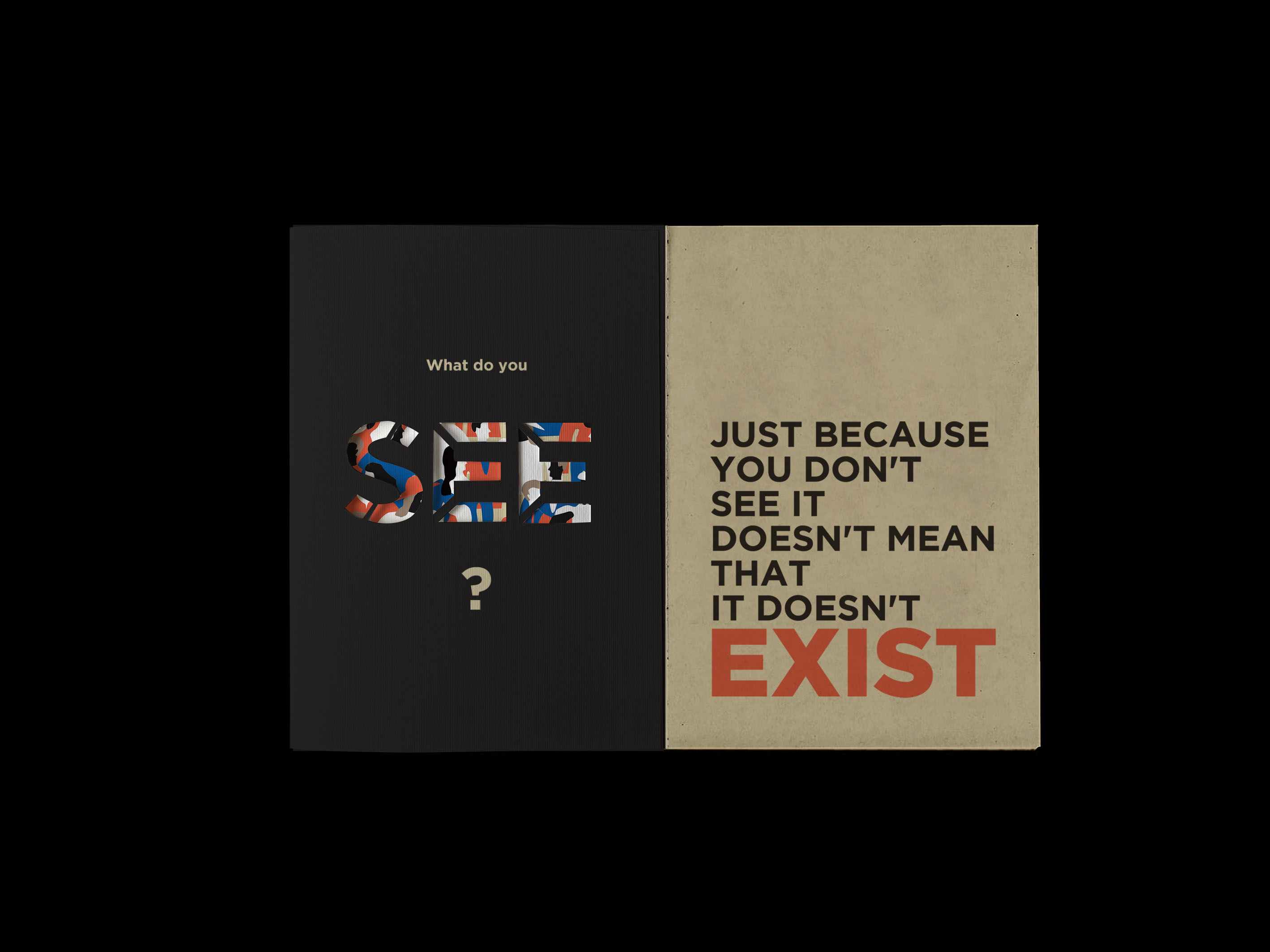
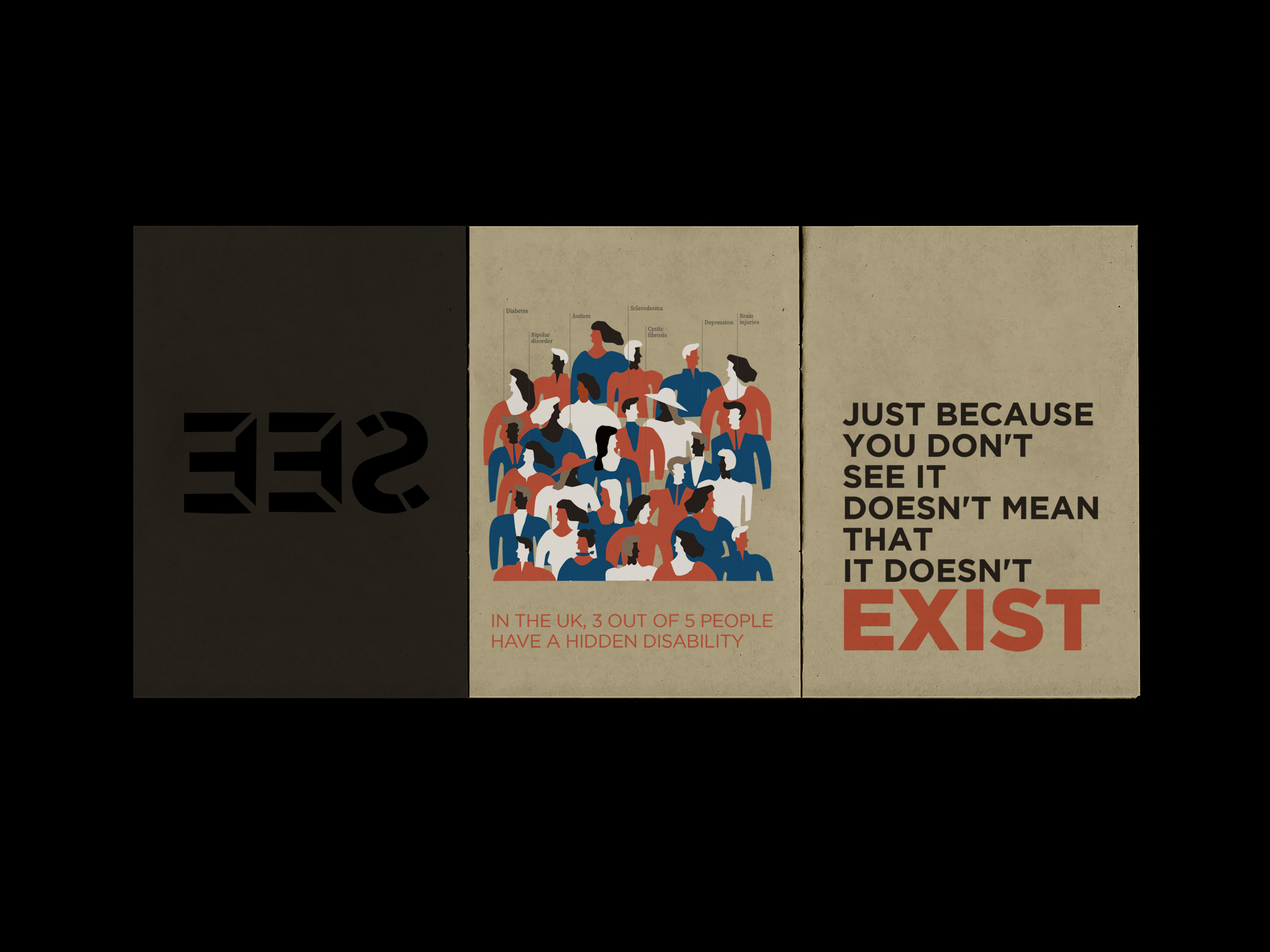
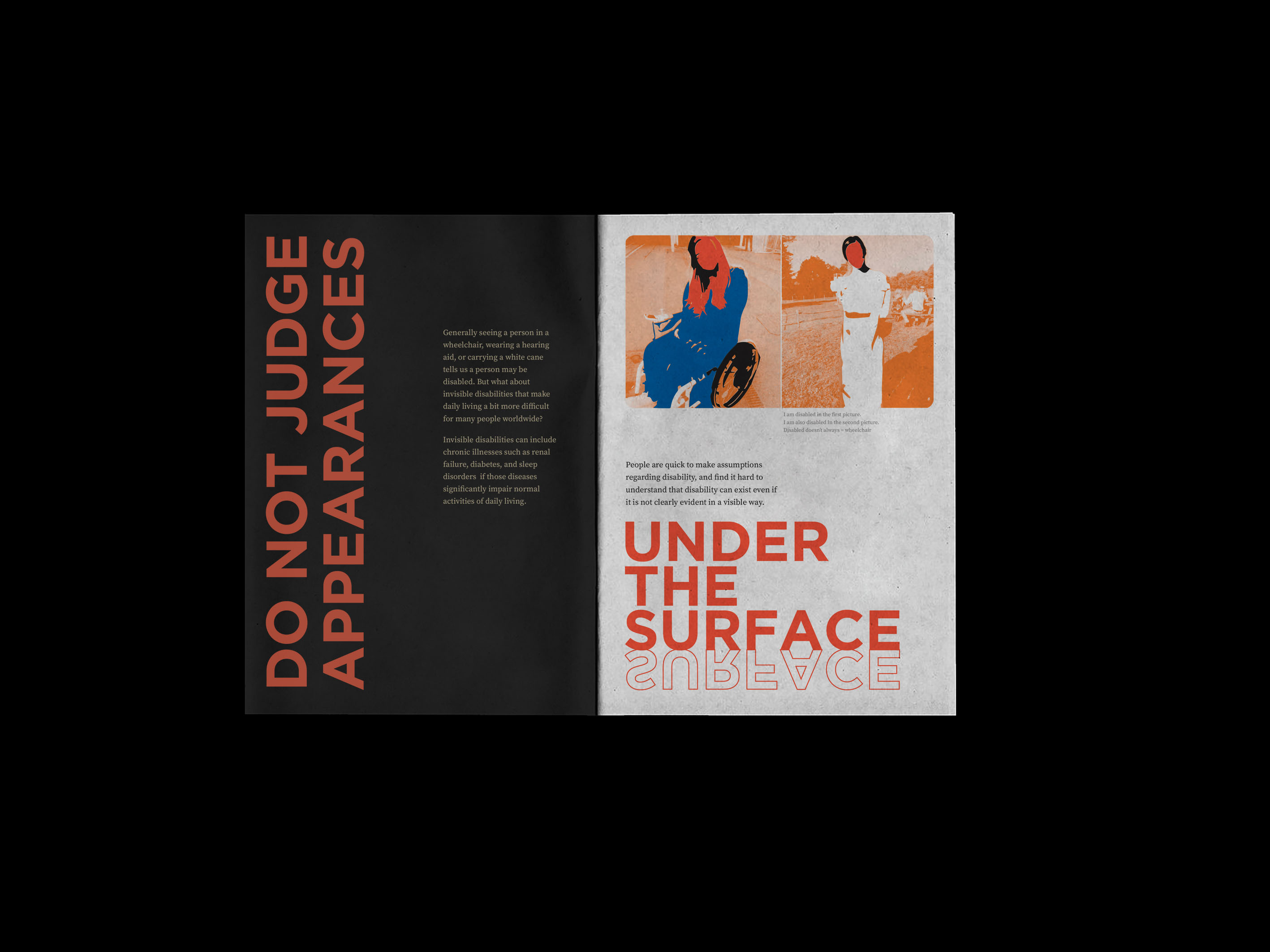
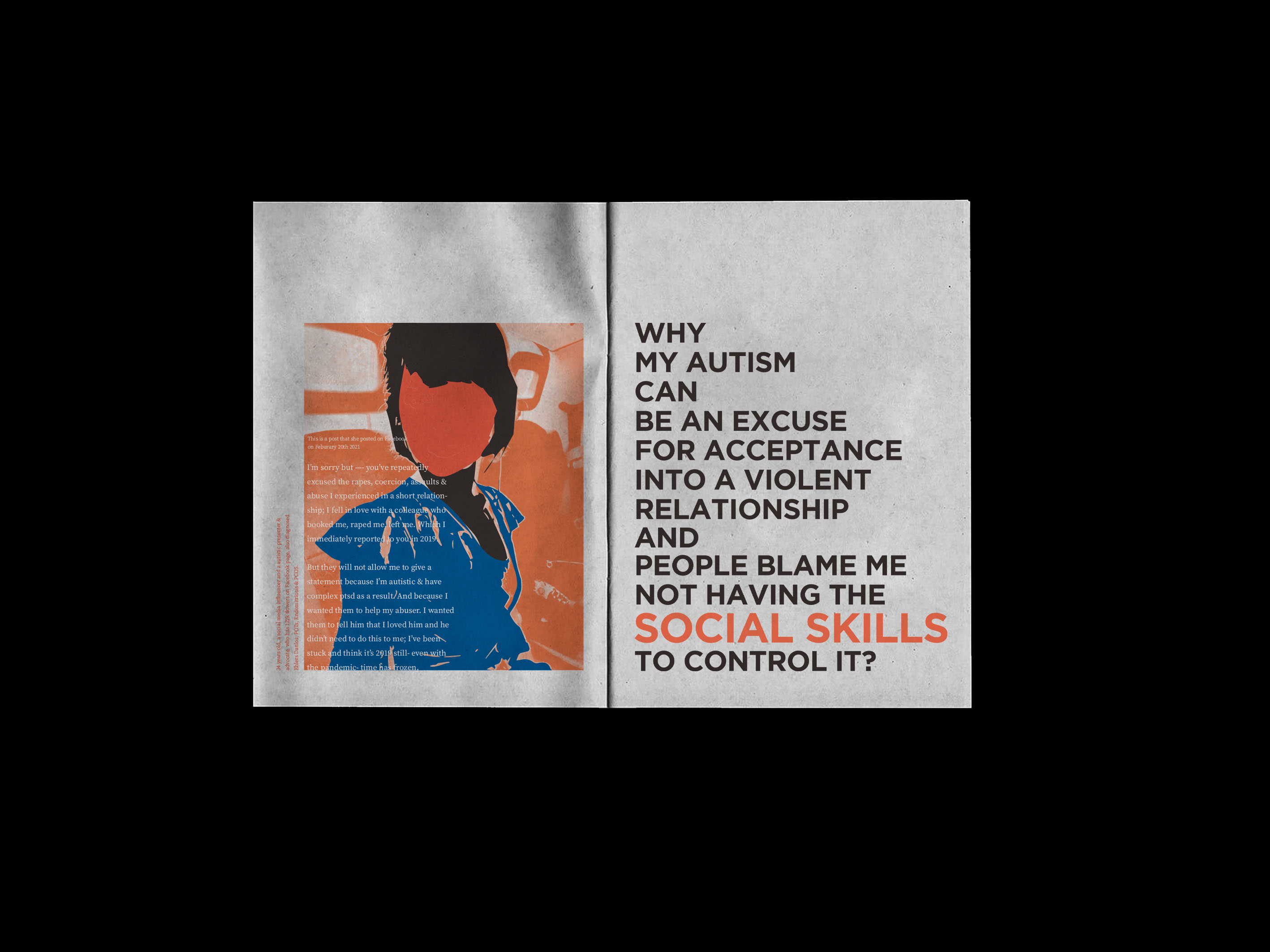
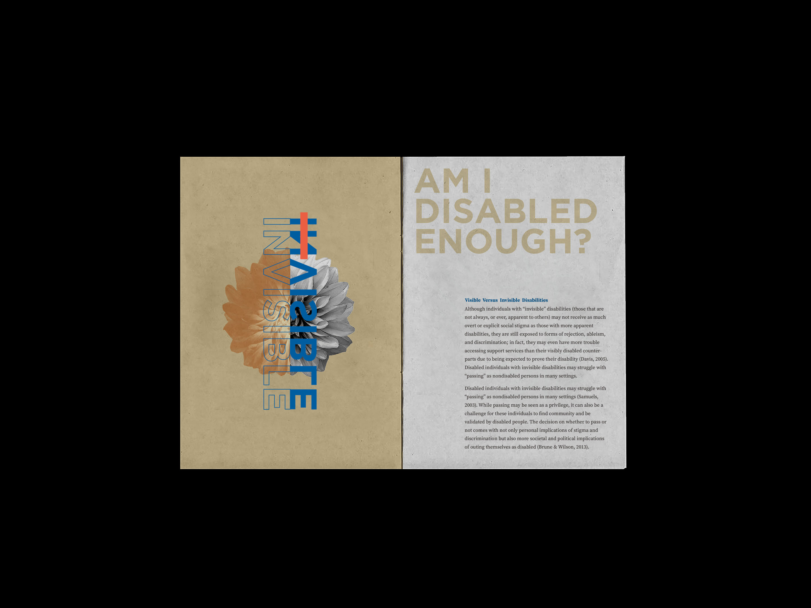
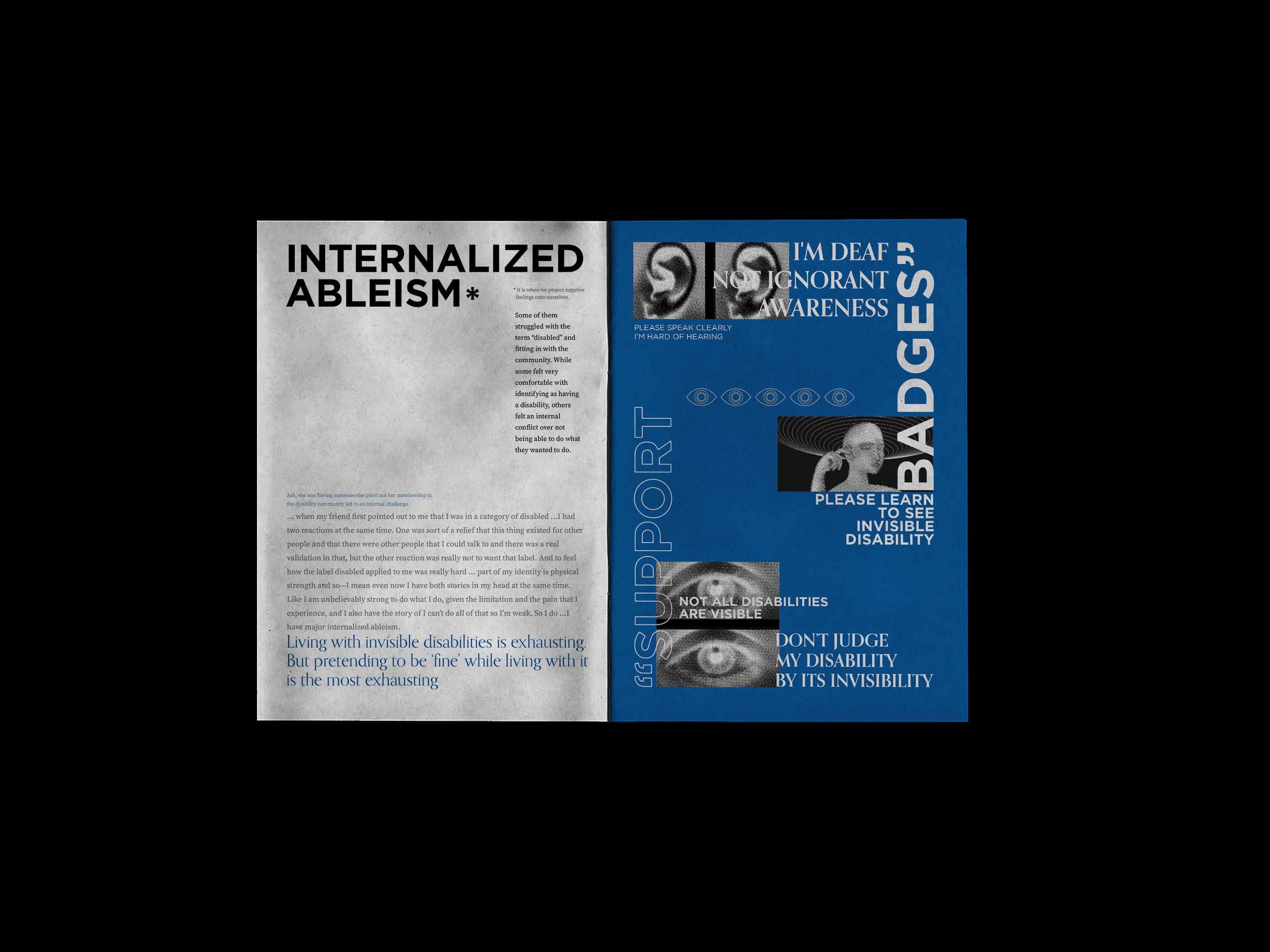
Most people do not really pay attention to people with disabilities or do not understand their life, and as a result, can feel awkward or avoid interacting with them. And that is not even to mention those people with invisible disabilities yet. These are certain kinds of disabilities that are not immediately apparent to others. Sometimes it is easy to judge people by the way you see them. We often pass judgement on people from the outside rather than the inside. There are a lot of people with disabilities who are less well treated and need assistance in getting support from society, and that is more than we think. My attention is to raise people’s awareness of human inequality through this project.
The Solution
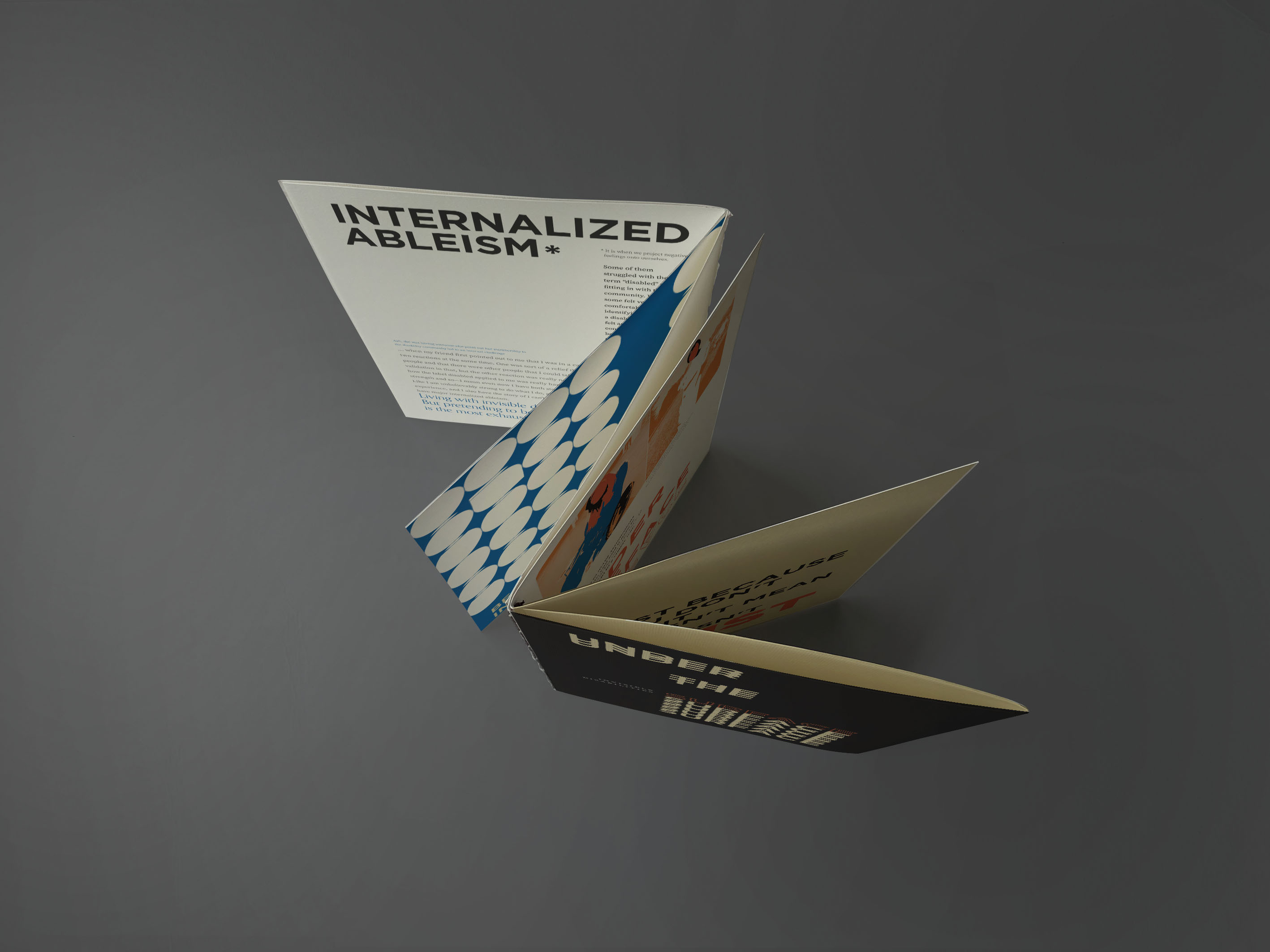
The requirement for this project is to design a zine. My approach is not only make a printed zine, but also can make the interaction with the audience. I was focusing on the relationship between the layout and the structure of the zine, and consider a proper and acceptable way of manifesting content. I intended to use typography mainly to give attractive attention so images come second in the hierarchy. For the colour palette, I wanted to choose bold and strong colours, to avoid making the visual too messy and colourful. One of the objectives is to educate people so that there’s a lot of context to explain what an invisible disability is.
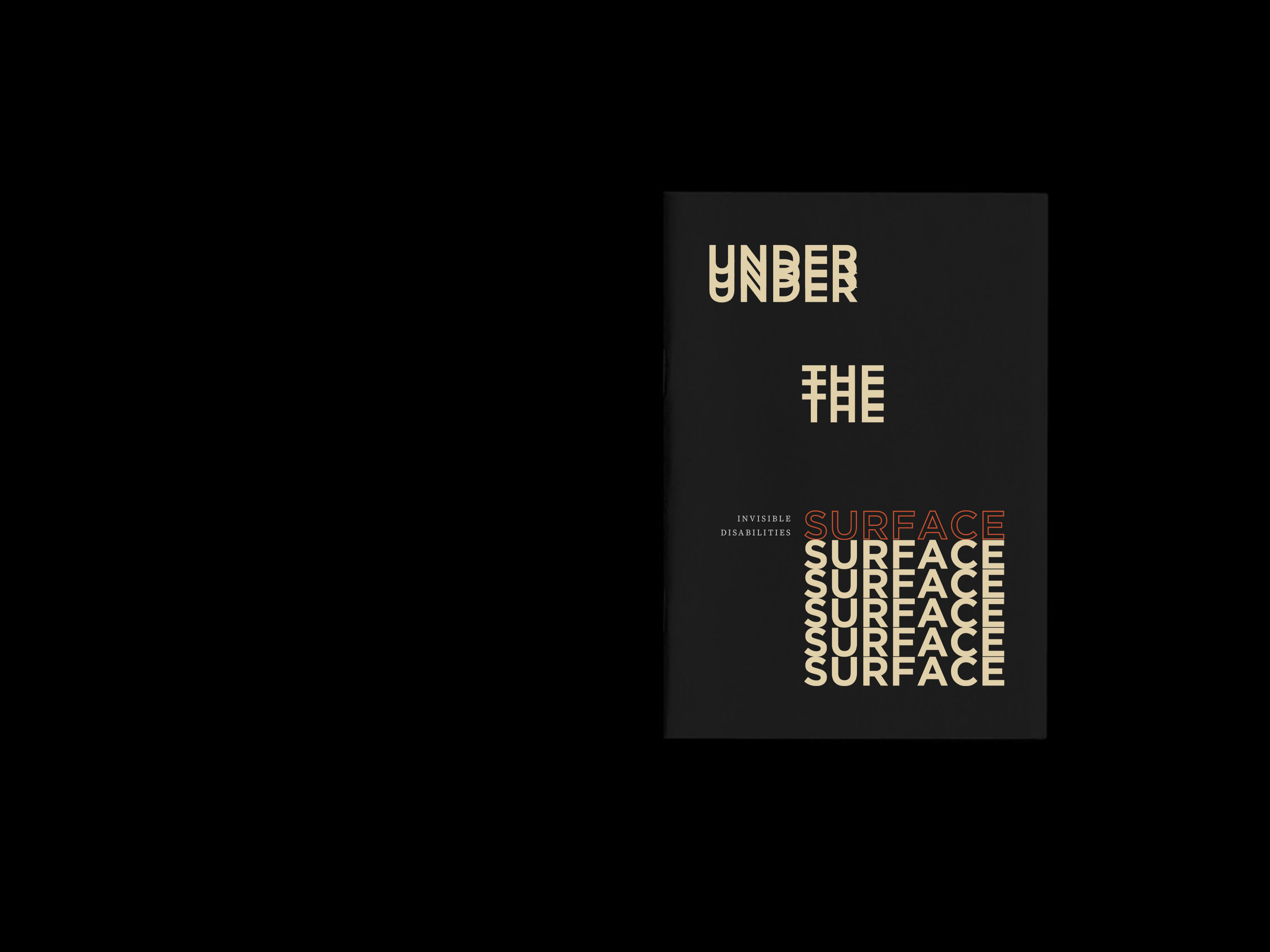
For the motion poster concept, I used the cover design to create a motion by revealing the letters over the surface. And the invisible disability bracelet is an idea of the invisible disability wristband. It encourages people with invisible disabilities to wear it to remind others of their circumstances. This is to let the world know you’re no more invisible.