— Graphic Design — Brand Identity — Visual Communication — Packaging Design  — Marketing Strategy — Printing — Exhibition — Environmental graphics — Graphic Design — Brand Identity — Visual Communication — Packaging Design  — Marketing Strategy — Printing — Exhibition — Environmental graphics — Graphic Design — Brand Identity — Visual Communication — Packaging Design  — Marketing Strategy — Printing — Exhibition — Environmental graphics — Graphic Design — Brand Identity — Visual Communication — Packaging Design  — Marketing Strategy — Printing — Exhibition — Environmental graphics — Graphic Design — Brand Identity — Visual Communication — Packaging Design  — Marketing Strategy — Printing — Exhibition — Environmental graphics — Graphic Design — Brand Identity — Visual Communication — Packaging Design  — Marketing Strategy — Printing — Exhibition — Environmental graphics

GOLDEN CLOUD HOTEL   ︎ Hospitality

Brand Identity | Collateral

The Challenge

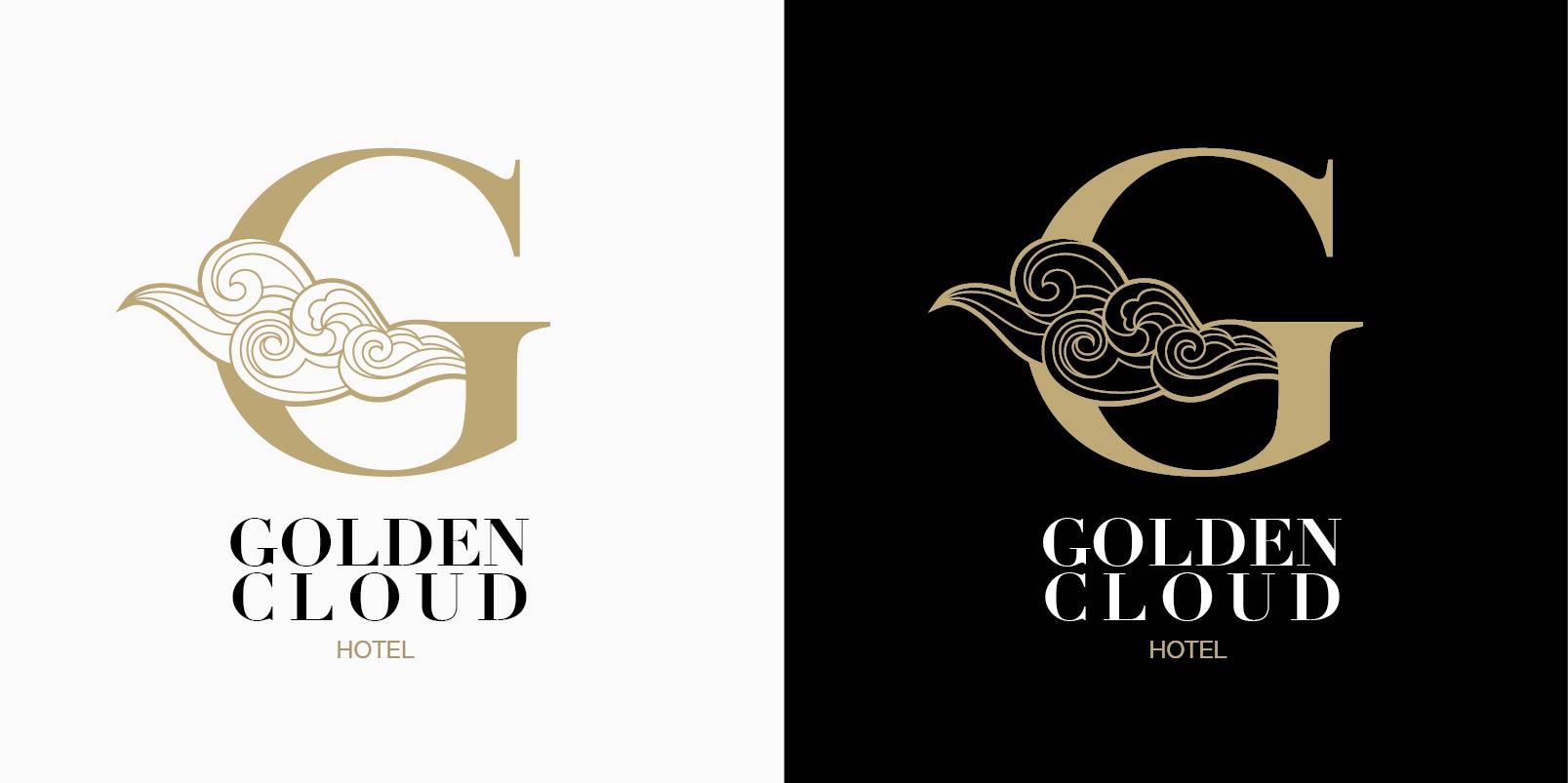
This is a brand-new hotel, which is located on the coastline of Taiwan. Like many brands that have created a new offering, there’s the balance of protecting the value of the original culture from the innovation of the future. It presented us with the challenge of the combining traditional and modern, old and new and merging them to create a distinctive identity.

The Solution

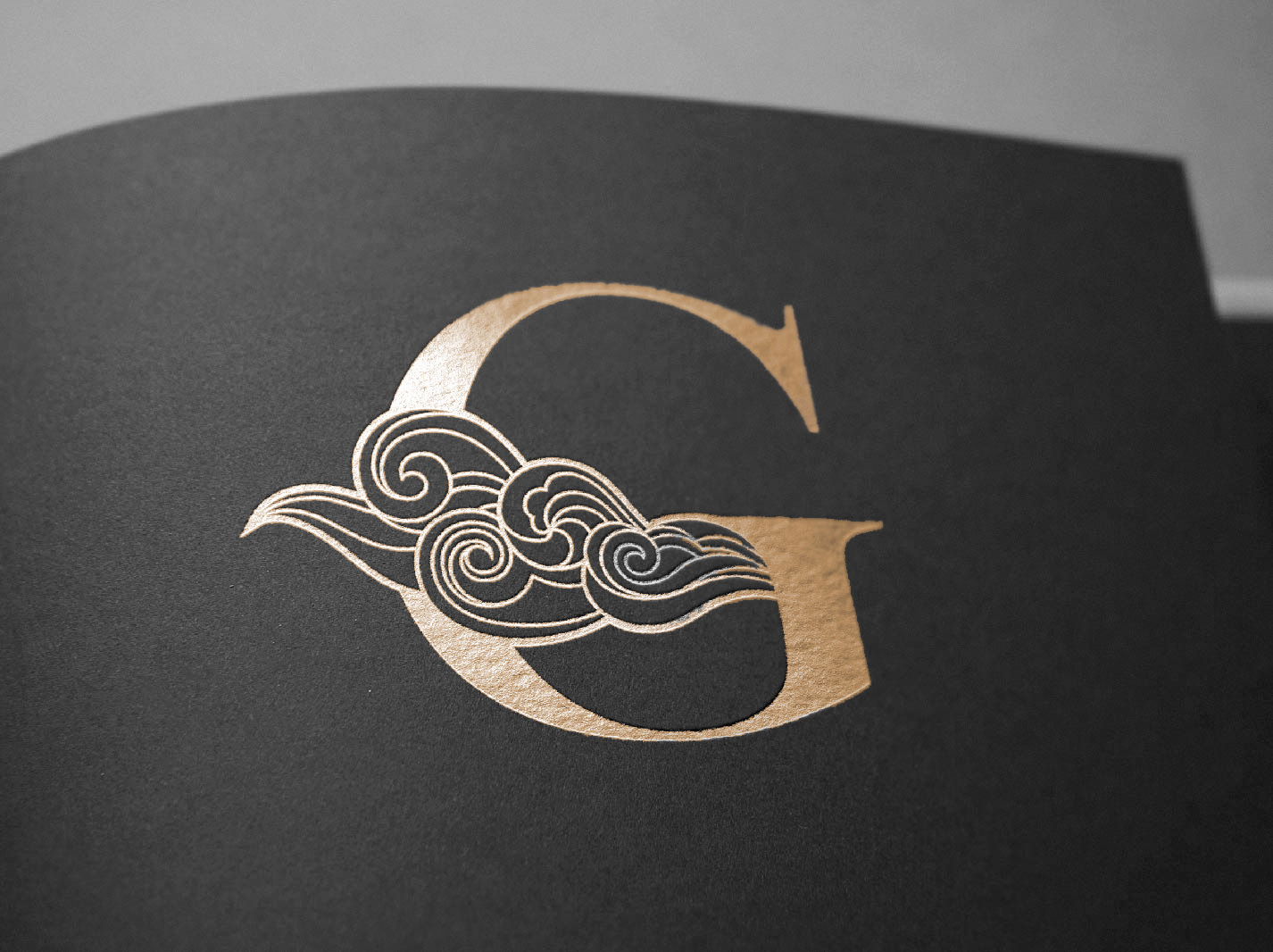
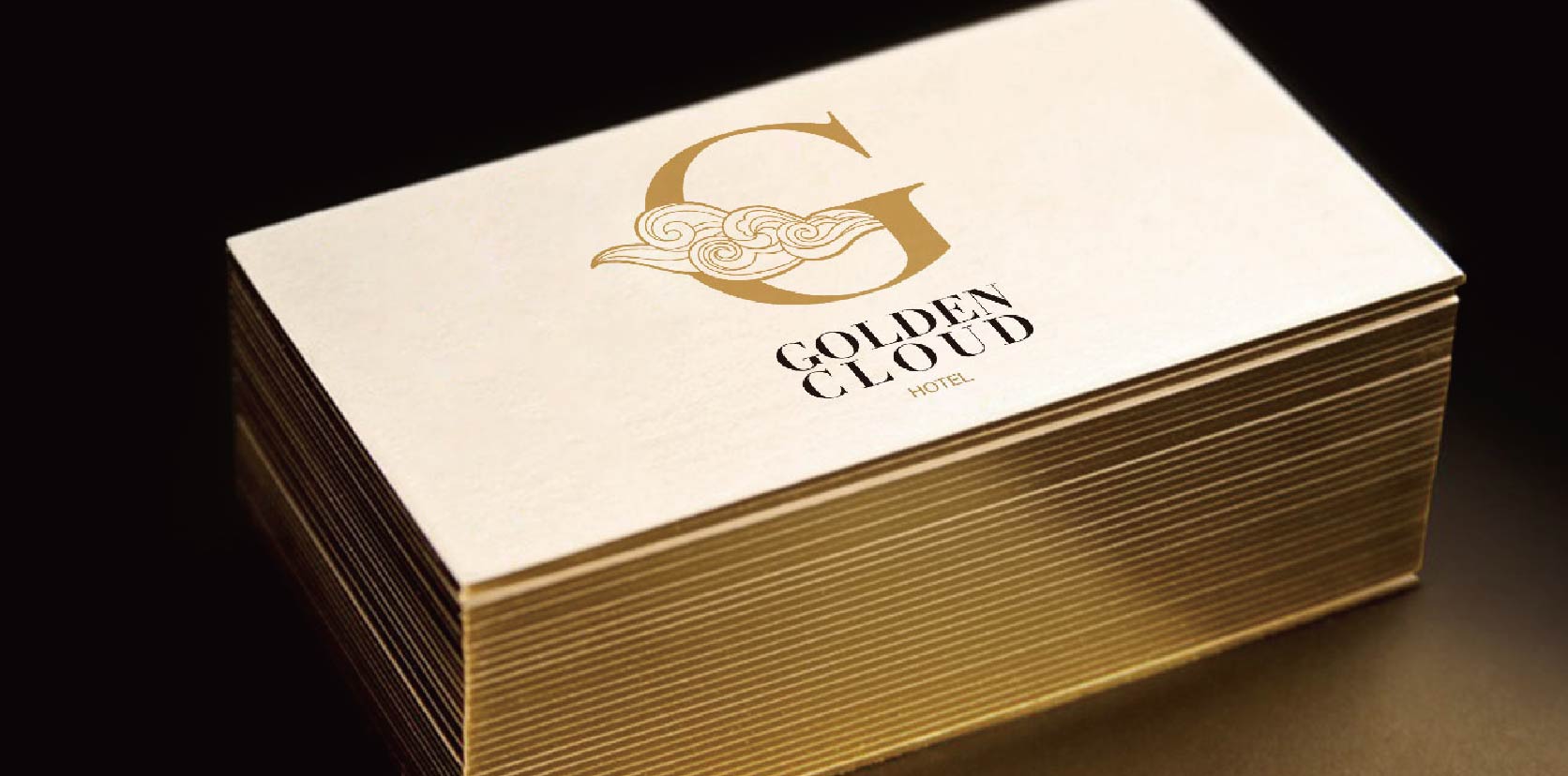
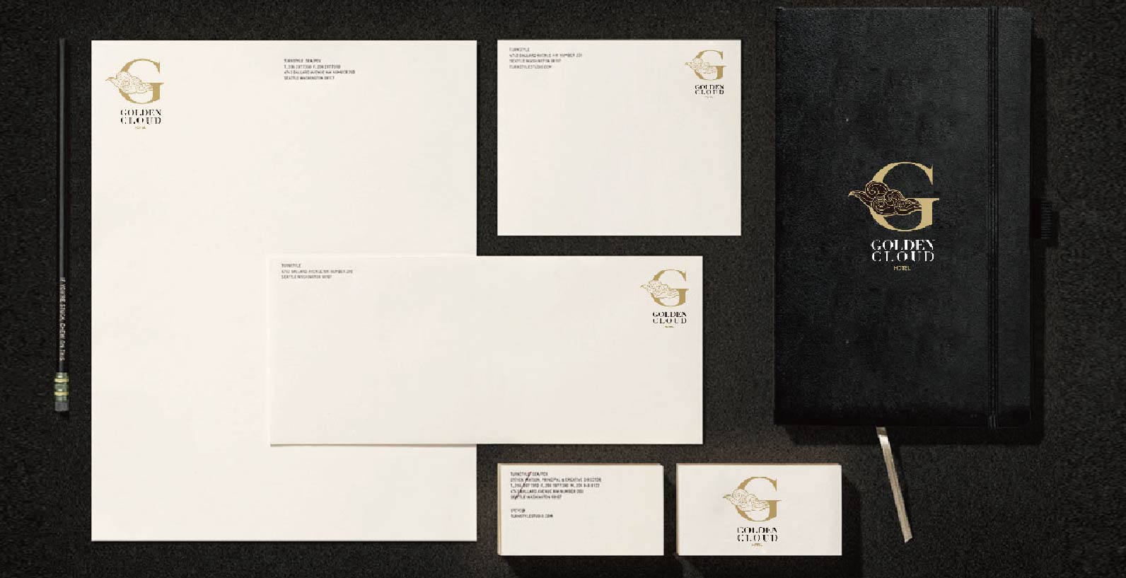
My solution was to combine the elements of Western and Eastern cultures together by combining the English letter and oriental style cloud graphic. Elevating the attraction of the icon with delicate and sophisticated details, making gold colour reference into the branding construction, also making it exclusive and elegant.

Design
is
a journey
of discovery.