


CHOSEN ︎ Sport Industrial
Catalogue Design | Exhibition Visual | Image Editing
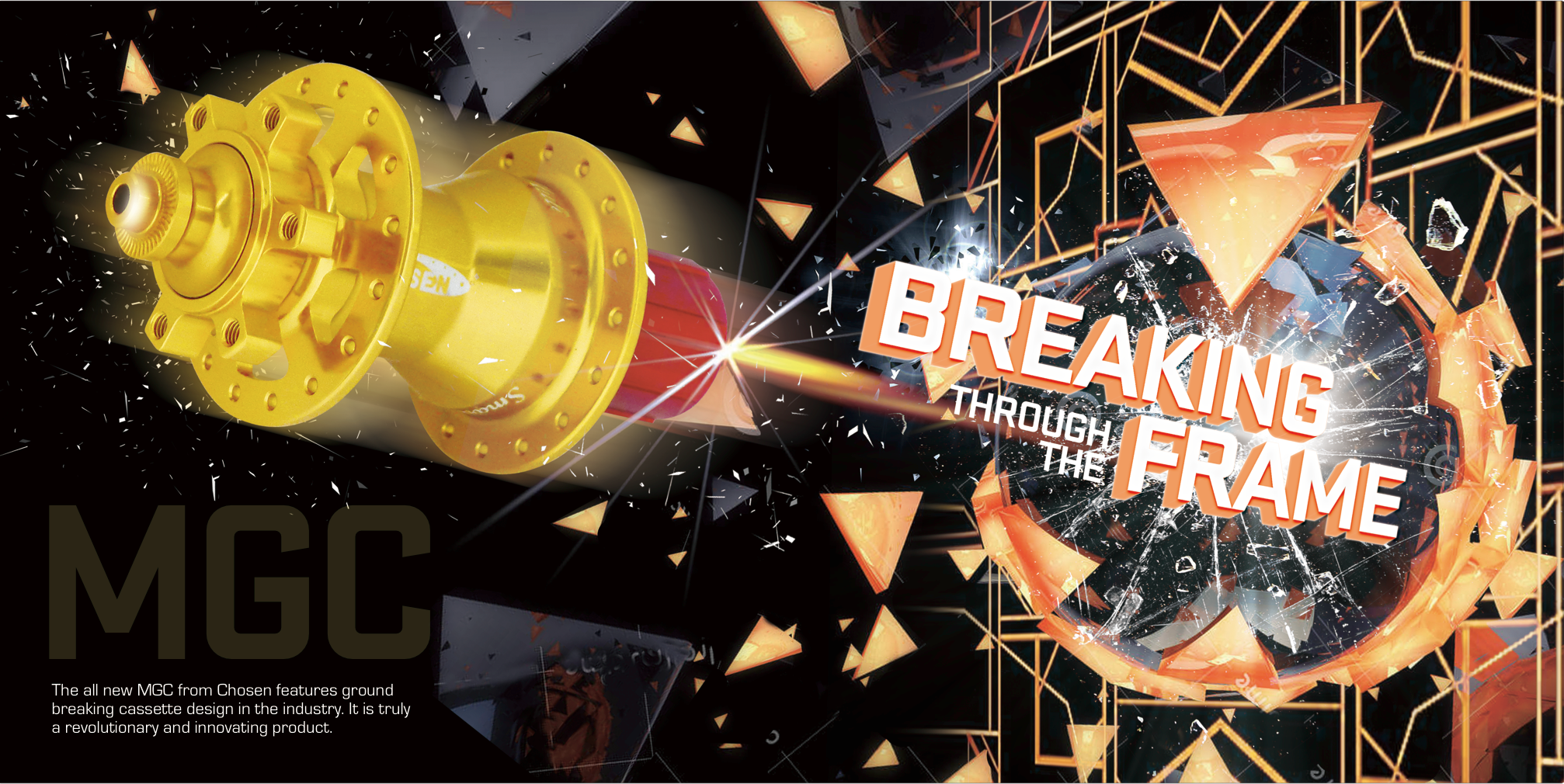
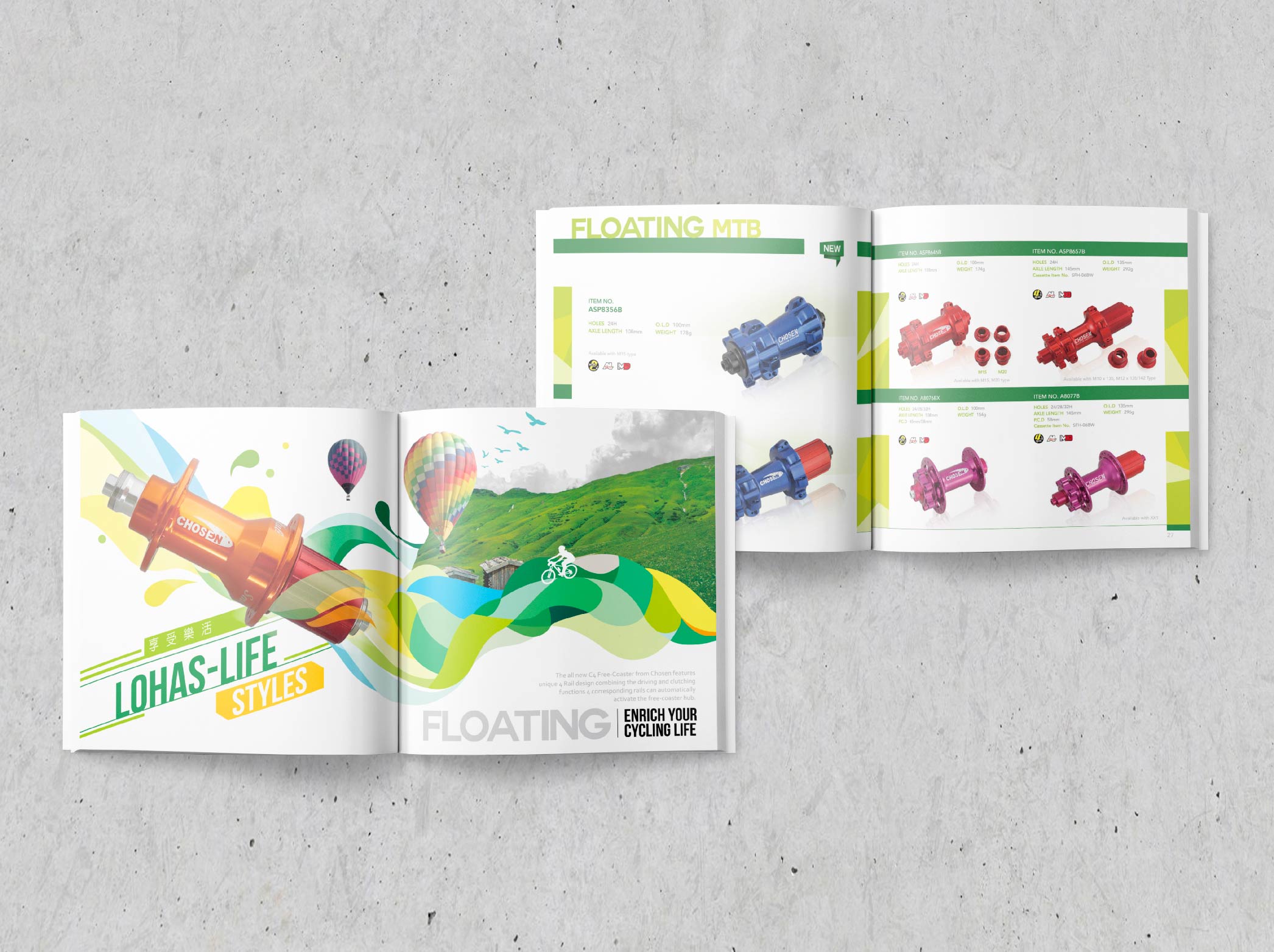
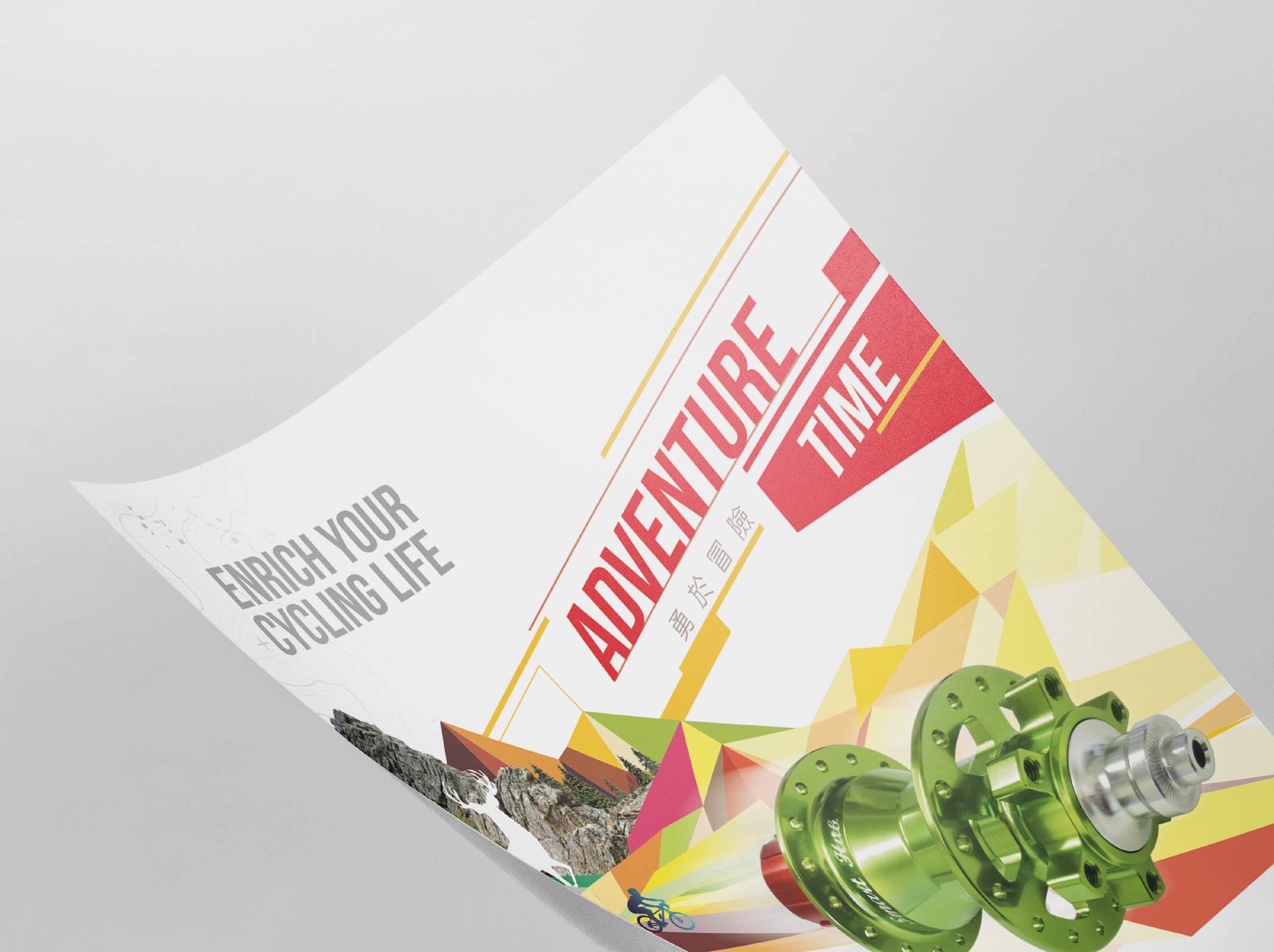
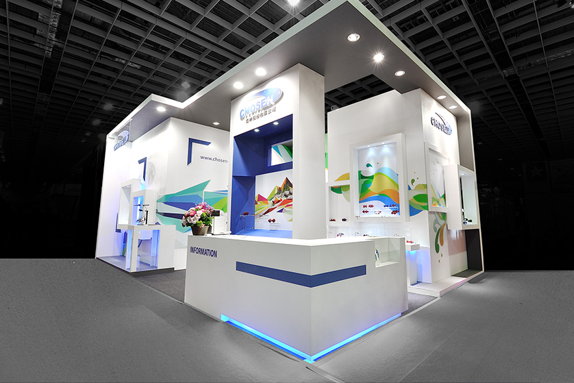
The Challenge
Chosen Hub is always looking for new breakthroughs beyond any limitations, not only challenging the improvement of technology, but also focusing on the character of brand identity. They always anticipate new and creative ideas that would better reflect its position and unfold these ideas for the preparation of the Bike exhibition each year. Ready to outstand from the industry.
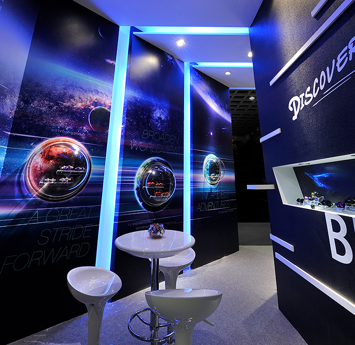
The Solution
The creative solution to this dynamic identity was to activate this brand’s most vivid energy. My concept was to use abstract elements with various colours that, in a sense, represent the imagination and the adventurous spirit in order to communicate with people. The visual remained constant while designing the advertisements, catalogue and the exhibition space. My approach had to be as experiential as the brand itself.
Co-worker ︎ 3D modeling designer(Zoe Pan)
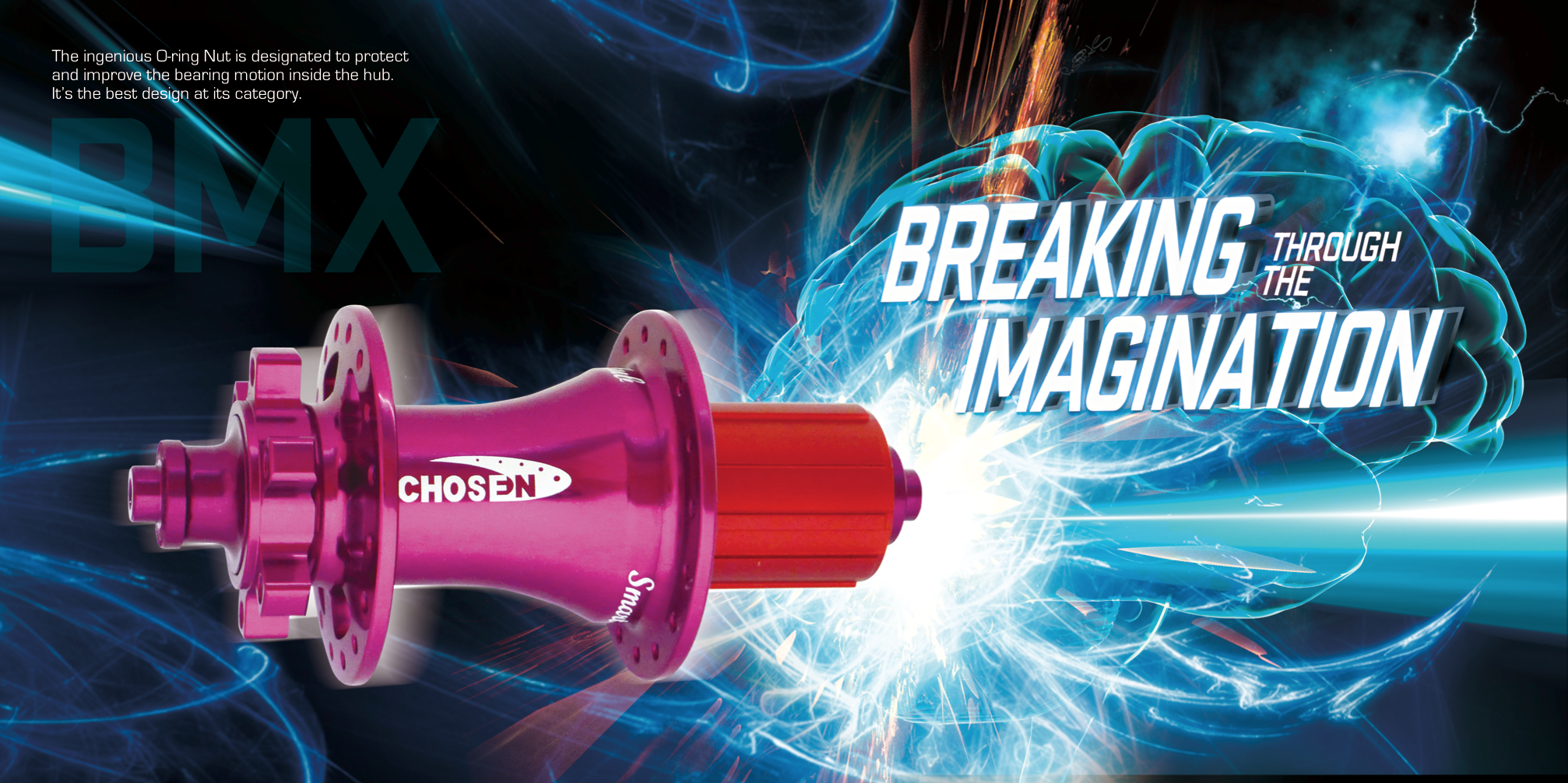
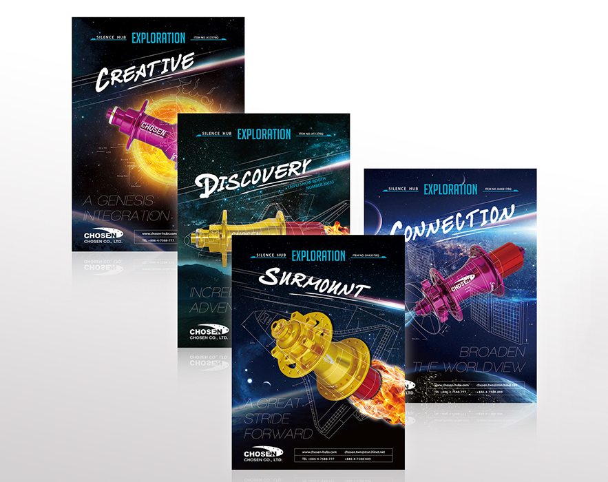
The Challenge
Chosen Hub is always looking for new breakthroughs beyond any limitations, not only challenging the improvement of technology, but also focusing on the character of brand identity. They always anticipate new and creative ideas that would better reflect its position and unfold these ideas for the preparation of the Bike exhibition each year. Ready to outstand from the industry.
The Solution
The creative solution to this dynamic identity was to activate this brand’s most vivid energy. My concept was to use abstract elements with various colours that, in a sense, represent the imagination and the adventurous spirit in order to communicate with people. The visual remained constant while designing the advertisements, catalogue and the exhibition space. My approach had to be as experiential as the brand itself.
Co-worker ︎ 3D modeling designer(Zoe Pan)